
When it comes to building a brand, the logo is the most important element. It’s the first thing people notice and form an impression of your brand. So, choosing a logo is as important as the other elements of any business. Whenever we talk about a logo, there are a lot of things to research, like layout, typography, and a lot more things, but what we commonly miss out that is color. Without color, the logo couldn’t speak to the people; for that reason, your brand image may go down. In this blog, the best Logo Design Company in Kolkata will tell you, which color palette would be suitable for which business domain; also they will analyze the color psychology of each sector.

Why Color Matters in Branding
Colors stir up feelings and change how we see things. Picture how relaxed you become when you look at gentle blues, or how red catches your eye right away. In logo design, color does more than just make things pretty; it tells a tale. It sets the mood for your brand’s character and makes your business stick in people’s minds. Picking the right color can make people trust you, show you’re professional, or even make them hungry.
What Colors Work for Different Sectors?
Let’s explore how different industries use color to connect with their audience:
- Technology (Blue, Gray): Blue is often linked with trust, intelligence, and efficiency, perfect for tech brands. Gray adds a sleek, modern feel.
- Healthcare (Green, Blue): These colors represent healing, calmness, and cleanliness. They create a sense of safety and care, which is essential in health services.
- Food & Beverage (Red, Yellow, and Orange): Warm colors stimulate hunger and energy. Red grabs attention, yellow creates a happy vibe, and orange adds warmth and friendliness.
- Luxury & Fashion (Black, Gold, and Purple): Black is a very gentlemanly color and has elegance. Gold represents luxury, and purple indicates royalty and creativity; it’s suitable for high-end or fancy brands.
- Eco-Friendly & Nature Brands (Green, Brown): Green means the color of nature; on the other hand, brown color indicates the soil and mud. And these two combinations represent the planet. So, these color combinations are best for any eco-friendly brand.
- Education (Blue, Green): Blue shows trust and wisdom, while green symbolizes growth and learning, great choices for educational institutions and platforms.
- Finance (Blue, Green, and Black): Blue again shows reliability, green suggests wealth and success, and black represents power and authority, key traits for financial businesses.
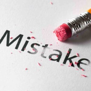
Common Color Mistakes to Avoid
A typical error is using too many colors, which can overwhelm or puzzle your viewers. It’s also key to avoid picking colors just because they’re in style; always think about what fits your brand’s message. Always remember that every color has a different meaning, so whenever you choose a color, make sure you understand the story of that color.
Conclusion
Deciding on any color for your brand logo it’s not a fancy thing. It’s a strategic element that can elevate your brand vision, purpose, and goal in the form of a logo. Also, it can connect with more people towards your brand, and make your brand more popular. So, designing a good logo with the right color can not only elevate your brand, but it can also open the window to success. If you want to create a new logo that aligns with your brand or redesign your existing logo, you can contact Purpple Designs, the best Logo Design agency in Kolkata, and make your brand value big.