
Continuing with the history and evolution of logo designs of famous companies, after Shell, we are going to tell you about the famous company; IBM. IBM is a very well-known company not only for its business but also for its logo design.
CTRC: The First Name
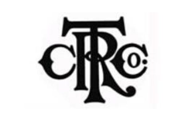
Founded in the year 1896, IBM was first established as the Computing Tabulating Recording Company by Herman Hollerith, in Broome County, New York. At that time the logo design of the company was pretty straight forward and traditional. It presented the company by the first letters of the company’s name CTRC, designed intricately.
Writing The Whole Name
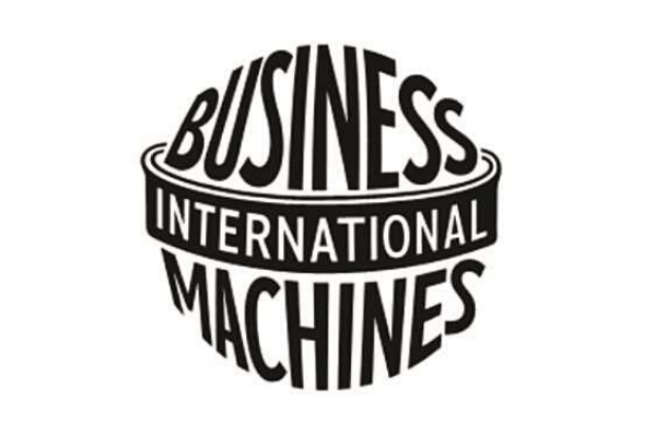
Finally, in 1924, IBM adopted its current name. Along with that, they changed both their business and the logo design. IBM which stands for International Business Machines was represented in the whole logo design. It was made into globe shape to represent the company’s global presence. The words ‘Business Machines’ was shown in a sans-serif typeface and the word ‘International’ was written surrounding the globe. Even though the logo was criticised by some, it remained the logo design of the company for more than 20 years.
Going Simple And Short
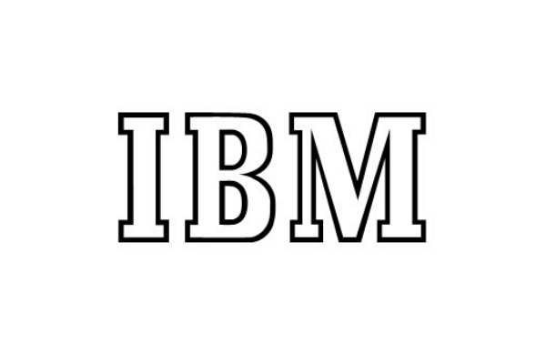
The next logo design of the company was designed in the year 1947 and it was used for the next 10 years. During this year IBM transitioned from punched cards to computers. This time the logo designer went simple and replaced the globe to the letters IBM. Not only that they simplified it more by keeping the body of the design white. It was probably the simplest and practical logo design of the company.
Continuing With Simple But Sharp
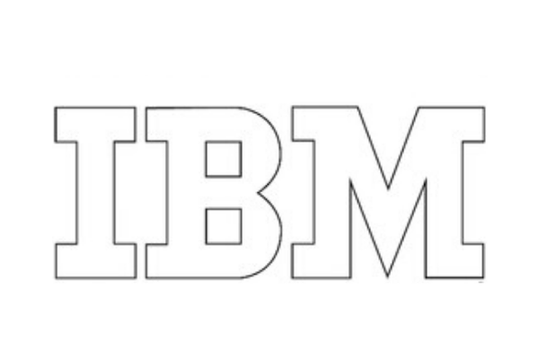
In 1956, there were only a few changes in this logo design. The letters were made bolder. The valley in the B was made sharper. It not only appeared to be more intense but also gave a sense of competitiveness. This logo design stayed the same for the next 15 years or so.
Strips Is The New Way
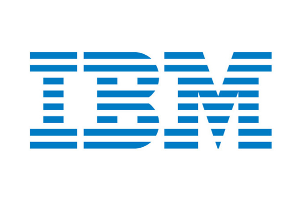
The final logo was designed in the year 1972 by the talented designer Paul Rand. It became so much success that even now IBM has the same logo design. Paul Rand gave such a modernised look to the design so many years ago that even now this design is praised by critics and is still now relevant in today’s world. The bold letters got replaced by eight horizontal strips in every letter. It is said that these strips represent speed and dynamism.
Like all other famous companies, IBM has a reputation for being unique and updating themselves with time. Their logo designs are capable of showing that evolution is always needed. If you are also interested in evolving your logo design, you can hire Purpple Designs in Kolkata.