When we talk about mobile phones, the first thing we remember is that Nokia was the first company to become successful in making the term mobile popular in the whole world. This was never an easy feat to achieve. A lot of people’s common belief is that they were there at the right time, which could not be further from the truth. What started as something to do with electronic devices to communicate, it suddenly changed the whole world of communication drastically one day. But do you ever think about how it all started and how Nokia became what it is today?
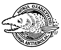
Beginning from 1865, Engineer Fredrik Idestam started the company from a wood pulp mill in a small town of Tampere, in southern Finland. Since then, the company has grown so much over the years and so has its logo design. In 1866, Nokia created its first logo design. It only had an image of a fish. The second mill was by the Nokianvirta River. Hence, it is interpreted as the salmon fish of the very same river. This is also where the name Nokia came from. At that time, they were manufacturing paper.
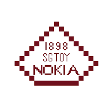
The second update of the logo came in the year 1898. this is when the company started manufacturing rubber. The logo is a red triangle where “1898 S.G.T.O.Y NOKIA” written in it. Granted, this logo is not that impressive. But the new company tried to manufacture a lot of things like bicycle, car tires, communication cables, electrical machinery, televisions, and a lot more.
![]()
In 1965, Nokia Corporation was created. The logo design was a black and round emblem. Inside this, the word “Nokia” was written in capital and white colour. During this time, Nokia’s main focus was on the cable industry, but the Logo itself doesn’t seem to say much.
![]()
Nokia used this new logo, for a very brief time, in 1967. In its new logo, the word Nokia was written in light blue and bold. On the top was some sort of trident in black. This trident represented the mobile cells and the connection from the phone to the cell towers.
![]()
But immediately the logo “Nokia connecting people” came into play, which we see even today with only a few modifications. There are two versions of this logo. Ove Strandberg created the first one, where you can see two different fonts of NOKIA and CONNECTING PEOPLE. But, the logo that we see today was created immediately after that. Erik Spiekermann of Germany created this logo. By this time, Nokia established itself as the mobile company that we know today.
You can see what a major role a logo design plays when a company keeps evolving and growing. In the next blog, we will tell you about the history of the logo design of the company Shell.