TATA Group, one of India’s largest and oldest conglomerates with a significant global presence, reflects India’s rich history over the years. This group was founded by Jamsetji Tata in 1868 and has now grown into a global business, expanding into various sectors like steel, automobiles, information technology, telecommunications, and many more. The growth and adaptability over time of the TATA Group are visually represented to us through its logo designs.
In today’s blog, we will delve into the evolution of the TATA logo, exploring the various changes it has undergone over the years to shape a better and more interconnected world, as suggested by the Logo Design Company in Kolkata. So, enjoy reading this blog.
Beyond Boundaries: The Story Behind Tata’s Logo Evolution
The evolution of the logo of the TATA Group illustrates its ability to adapt to change over time while at the same time preserving its core values and identity. And this is what makes TATA Group Logo Designs different from other logo designs.
The early logos of the TATA Group were simple, and the company’s name was often featured in a classic font, which evoked a sense of tradition and reliability. As the year passed, TATA introduced a distinctive “T” symbol, which became the central element in its logo.
Though the logo design is simple, it carries a legacy over time.
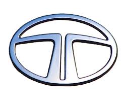
Image Source = Logo History
From Steel to Software: The Evolution of the Tata Logo
As we are all aware, TATA started its business in the steel industry, and now, as we can see, it has diversified its industries into various sectors like software and technology. But how does it reflect its evolution over time? Yes, it’s a visually elegant logo design.
Throughout its evolution, TATA has symbolized its core values of integrity, excellence, and responsibility through this logo design. From steel production as its roots to invasion into the software and technology sectors, the TATA Group logo designs reflect its resilience and adaptability. Thus, playing a vital role in India’s industrial and economic sectors.
Genesis of the Tata Logo
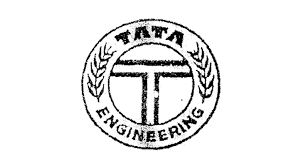
The early years of the TATA Group’s logo designs were primarily involved in the textile industry. It was in 1910 that TATA saw its official design. The design was created by the company founder, featuring a blue oval with the letter “T” at its center, surrounded by a wreath of leaves.
There have been several modifications to the TATA Group logo designs, but the core elements have remained the same since then. Contemporary design trends have been adapted by the logo to preserve its historical significance, thus representing the evolving nature of the TATA Group. Therefore, it became an iconic symbol associated with one of India’s oldest and most reputable business conglomerates.
If you want any modifications to your logo or want a new logo design, then visit the most promising logo design company in Kolkata.
Evolutionary Phases
The transition from the initial logo to subsequent versions reflects the evolution of the TATA Group’s values. The initial logo was done in the years around 1870–1938. The current logo was designed around 2013. Throughout these transitions, TATA Group aimed to balance its continuity with modernization. Throughout these transitions, the Tata Group has aimed to balance continuity with modernization, reflecting its rich history while adapting to the changing business landscape.
At every point in time, the essence of the TATA brand captures milestones reflecting the company’s journey, global expansion, and commitment to modernity and simplicity in design. With the updated logo, Tata introduced a unified brand architecture in 2019.
Symbolism and Design Elements
Each iteration of the TATA logo design reflects the changing values and global nature of the TATA Group, thus emphasizing simplicity, clarity, and modernity. The selection of colors and symbols aims to convey the TATA Group’s innovation, strength, and forward-thinking approach.
It is important to understand the symbolic meaning and significance behind the TATA Group’s logo design choices. And for that, consider a holistic view that considers the company’s cultural perspective. The design elements contribute to the brand’s identity.
Among the symbols in the Tata logo might be:
- Typography: The logo’s typeface selection might imply modernism, strength, and stability.
- Colors: While silver or metallic tones might imply refinement and inventiveness, blue is frequently linked to trust, dependability, and professionalism.
- Wordmark: By including the business name in the logo, the Tata brand is highlighted, and brand identification is strengthened.
- Simplicity: The logo’s simple, uncomplicated style may stand for openness, truthfulness, and a no-nonsense attitude.
To get the best design for your logo, avail yourself of the Graphic Designing Company of Kolkata.

Impact on Brand Perception
The following factors should be taken into account when analyzing how the TATA logo affects public perception:
- Brand Recognition
- Historical Significance
- Company Principles
- Market positioning
- Corporate social responsibility (CSR)
- Communication
- Worldwide Acknowledgment
- Competitive Distinction
- Development through Time
Of course! Many businesses have changed their logos as a component of their larger marketing plans. Here are a few instances:
- Uber as of 2018
- Gap (2010)
- Instagram (2016)
- Pepsi (2008)
- Mastercard (2016)
When a well-known brand like TATA changes its logo, initially people are surprised or confused, but with time they adapt to the change. There may be positive as well as negative feedback from the public, but the company should know how to deal with it. So, as done by the TATA Group, this sets a competitive edge for the competitors. Which is a positive approach by companies like TATA Group.
Challenges and Innovations
Redesigning a well-known logo for a business like Tata, which has a strong sense of identity, may be challenging. Challenges could include:
- Brand recognition and legacy
- Stakeholder Consent
- Cultural Awareness
- Switching between platforms
- Public Welcome
Innovations and trends in logo design that Tata and other businesses may use:
- Minimalism and simplicity
- Flexibility in digital media
- Telling Tales with Design
- Adaptability
- Lively Logos
- Cultural Awareness
- Using Contemporary Design Trends in User-Centric Design
The development of the Tata logo shows us the significance of simplicity, flexibility, symbolism, and adhering to basic principles even as we change with the times. It’s important to remember that a redesigned logo will only be successful if it is in line with the brand’s values, appeals to the target market, and endures over time.

The Modern Era
The venerable Indian conglomerate Tata just revealed its newest logo, which represents a major advancement in its aesthetic development. The present Tata logo is an ideal example of how to combine heritage with modernity. The classic shades of blue and silver are kept, signifying dependability, devotion to quality, and trustworthiness. The modern, forward-leaning typeface exudes vitality and reflects Tata’s progressive stance in the quickly evolving corporate world of today.
Embracing simplicity is one possible route for the TATA logo design. The logo needs to be universal for TATA to keep growing internationally.
Beyond the Logo: Tata’s Overall Branding
A strong and cohesive brand image must be created by keeping branding consistent throughout these disparate entities, as is done by the TATA Group.
The “TATA Emblem,” or emblem of the TATA Group, has changed throughout time and is deeply symbolic of the company’s identity and ideals. Alliances and collaborations may indeed have an impact on a brand’s identity, including its logo.
The branding of the Tata Group, a multinational corporation with a wide variety of industries, extends beyond a simple logo. Several essential components of Tata’s overall branding contribute to its credible and powerful image. These include:
- Integrity and trust
- Variability in Business
- Cutting-edge technology
- Worldwide Presence
- Development and Welfare of Employees
- Long-Range Tata Sons as a Holding Company
- Symbolic Logo
All these elements combine to define Tata’s entire identity. Together, these components provide Tata’s robust and favourable brand image.
Conclusion
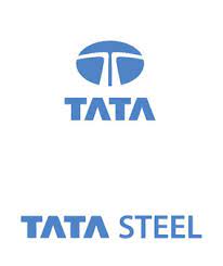
We hope this blog has been informative for you. As we have seen, TATA Group has seen an intriguing development in its logo, which is a reflection of its deep heritage and dedication to innovation. The journey started in 1945 when Tata unveiled its first official logo, a blue oval with the word “T” in the middle as a representation of honesty and trust.
Within the ever-evolving realm of corporate branding, the renowned Indian conglomerate Tata has seen an intriguing development of its logo, which is a reflection of its deep heritage and dedication to innovation. It is evidence of Tata’s capacity to welcome change while adhering to its core principles; this journey is what has shaped the company’s identity in the twenty-first century.
Therefore, if you are looking forward to building a brand reputation for your business through logo design services in Kolkata, then you must get in touch with the professional logo designers at Purpple Designs.