
In the previous blog, we gave you a brief history of the evolution of the company Nokia’s Logo Design. We will continue this blog with another famous company named Shell and its history and evolution of the logo design. Shell is an internationally famous energy company who is an expert in the exploration, production, refining and marketing of oil and natural gas, along with manufacturing and marketing of chemicals. The logo design of Shell is quite famous. But in order to know how it came into existence, we would need to start from the beginning.
In The Early 1900s

During this time, the first-ever logo design of Shell was not at all impressive. It was merely a poor black and white drawing of a mollusk shell. We all know that the shape of a mollusk shell is not very clarified, but on top of that poor designing made it all the more unappealing.
In The Year 1909

During this year they attempted to redesign the logo for the first time. To add an element of aesthetic value to it, the mollusk shell got changed to scallop shell. It certainly improved the appearance of the logo design. However, the black colour in the logo made it look unattractive. Even then, this design lasted as the company’s identity for two decades.
In The Year 1930

The second attempt was made in the year 1930. The basic change they made in this design was to make it look symmetrical. It was designed in the shape of a crown but was still black.
In The Year 1948
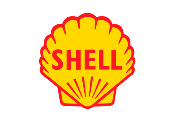
This is the year when the Shell company decided to introduce colour in its logo design. But unfortunately, this design became a huge disaster as the outcome looked like a hot air balloon rather than a shell. The clear lines that were made in the year 1930 were clearly missing. The introduced colours in the logo were only red and yellow. They chose these colours as these are the colours of Spain, and the company wanted to have an emotional bond with them. The most significant change was adding the name of the company in between. But overall the logo looked like it was hand-coloured.
In The Year 1955

There were only very few changes in this logo design. The red strokes from the previous logo were removed. It was given a more robust look. It was a very refreshing change and certainly looked more appealing.
In The Year 1961

The only change in this logo design was that it appeared inside a red square. It remained the symbol of Shell for the next decade.
In The Year 1971

In 1971, the company made some radical changes to the logo which still exist to this day. This logo was used for the next 23 years. It had clean lines with cut wide yellow strips. It introduced a major change by adding a border to the yellow strips and the whole logo with red colour. This red outline is still used. They also removed the name of the company from inside to the bottom of the logo.
In The Year 1992-1999

The only significant change in the year 1992 was that they removed the name from the logo design. Lastly, the last revision of the logo was done in the year 1999, in which the colour of the logo was dimmed. It was toned down a bit to make it look easy on the eyes.
The shell company remains the most inspiring company to this day in their business field and their logo design gives you a strong reason to create a powerful brand identity.
If you need a logo design for your company, you can come to Purpple Designs in Kolkata. In the next blog, we will be back with the history of logo design of IBM.