Launching a whole new logo design is not something new. A number of worldwide popular brands have already chosen to evolve their respective logo designs. However, it is to present their brands from scratch in front of the entire world. Likewise, Nokia, the globally-recognized information and communication technology company has rebranded itself with a reinvigorated brand-new logo design. In this blog, a renowned logo design service in Kolkata explores the interesting ins and outs of Nokia’s newly unveiled official logo design.
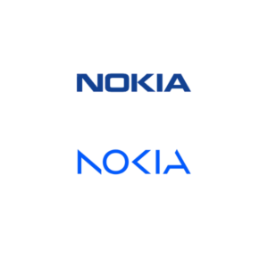
Nokia has launched this all-new logo design mainly to focus on networks and industrial digitalization. However, this iconic change of Nokia’s logo design has this time taken place after almost 6 long decades. This has been undoubtedly a dramatic change in the history of the Finnish communications and information technology company.
Potential reasons to change the logo design
Nokia has reshaped the company strategies and therefore, brought a drastic change in its logo design as well. Of course, the reason for changing its logo design is not sudden. This global telecommunication giant has been undergoing a vivid transformation for the past several years. However, right now Nokia’s foremost targets are on 5G network and technology and cloud-based networking services. Now, the new logo speaks for the company’s reputation. It changes its existing shift towards a way better future that is quintessentially digital and globally well-connected. In fact, this change is just a small part of the company’s new branding strategy that is all-new and unified.
The impact of changing the logo design
The newly changed logo of Nokia is way more than just a mere change in the previous logo design. This time, the logo design solely focuses on new innovation, evolving technology, and worldwide connectivity. It has been used as a long ladder in the digital world to a wider range of technology and communication services. So far, this change in logo design has received an immense positive response from the audience. Nokia is successful to boost its brand recognition, especially among the young generation of this decade. The youngsters these days are more likely to get attracted to modern and innovative brands and technology.
To conclude this blog, we must mention that the bold vibrant blue font of this newly-launched logo design by Nokia symbolizes progress and new innovation.
Do you want to make such a significant milestone in your brand by launching a span-new logo design? Get in touch with any reliable and experienced logo design services in Kolkata.
Also Read – History And Evolution Of Nokia Logo Design